Introduction
Color is a key part of visual design, and picking the right color scheme can have a profound effect on how a website feels. The colors you use can also affect whether someone can read your content easily, so read about how to make your color choices more accessible!
Color Contrast
Some color combinations can make text hard to read, especially for people with visual disabilities. There are lots of tools out there which can help you figure out if the colors you're using are accessible. They'll tell you the color contrast ratio between two colors, such as your text and the background. The Contrast Checker will allow you to test a pair of colors at a time, while a tool like WAVE can assess the color contrast of an entire page of your blog.
At minimum, the color contrast ratio requirements are:
- 4.5:1 for normal-sized text
- 3:1 for text that is 18pt or larger (or bold text that's 14pt or larger)
- 3:1 for user interface elements (within them, and against the background)
But bigger contrast (like 7:1 for normal text) is better! The main color for text on this website has a 13.98:1 contrast ratio against the background color, for example.
Color contrast requirements also apply to text in images, although logos are exempt. If you have any transparency or gradients in a design, you may have to test it manually, since tools often can't determine color contrast in those scenarios.
Using More than Color for Meaningful Content
We use colors all the time in design to denote meaning — like red-colored text to show debt, or yellow highlighting to make something stand out. But color is often inaccessible to folks. People who are colorblind can't distinguish between certain shades; for example, people with deuteranopia have trouble telling red and green apart. And blind folks using screen readers often won't be able to see the colors you use at all.
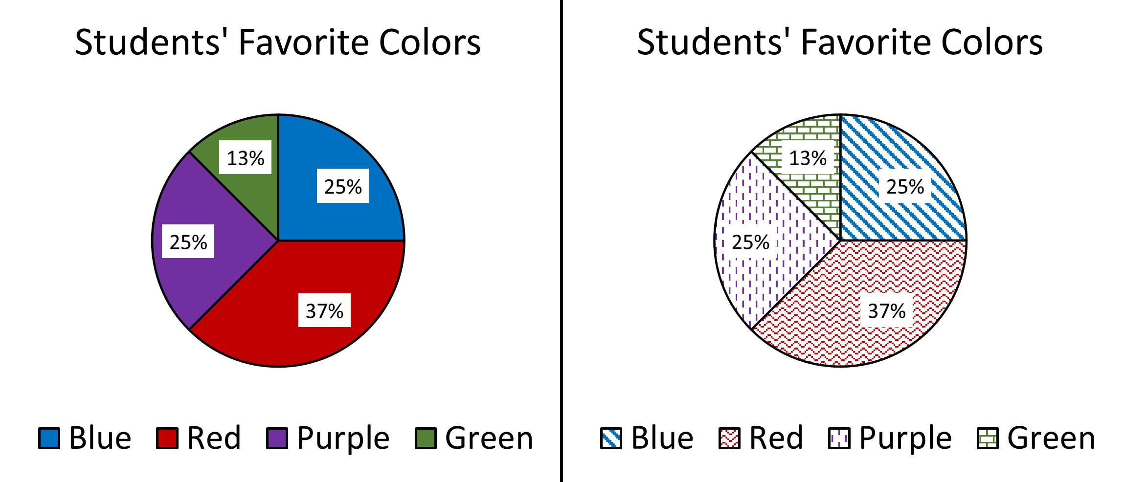
For this reason, it's important not to use color as the only thing conveying meaning. Use things like labels, patterns, and different shapes (with corresponding alt text) to make sure that important information is being presented in more than one way.

The pie chart on the right has different colored slices, but someone who is color blind or visually impaired might struggle to tell which slice corresponds to which item in the legend. The chart on the left uses different patterns as well as different colors, which makes it easier to tell which slices correspond to which legend item.